OMG ….This
is my 1st article for 2014. I am happy and it is for reviewing
Google’s product – the company I always look for something new
History
When GMail
was started 10 years ago, it redefined the email concept. Till then inbox size
was limited and we used to delete mails everyday to keep it going. Also the
interface was un-interesting and slow (we were using dial-up connection those
days remember). GMail gave unlimited storage (1GB in the start) and very simple
design and it was faster than others. It started getting attention and soon
became the most reliable email client.
Some users
were concerned that Google is reading their emails. The mails are automatically
scanned and used for context sensitive ads and filter spam. If you are worried
about that, I will suggest you look for some other email service.
Tabbed Inbox
Google
introduced various tabs for inbox in mid 2013. The mails will be categorized
into different tabs – Primary, Social, Updates, Promotions, Forums based on the
content. This is very useful since we get bunch of promo mails and we will miss
important mails from friends or work.
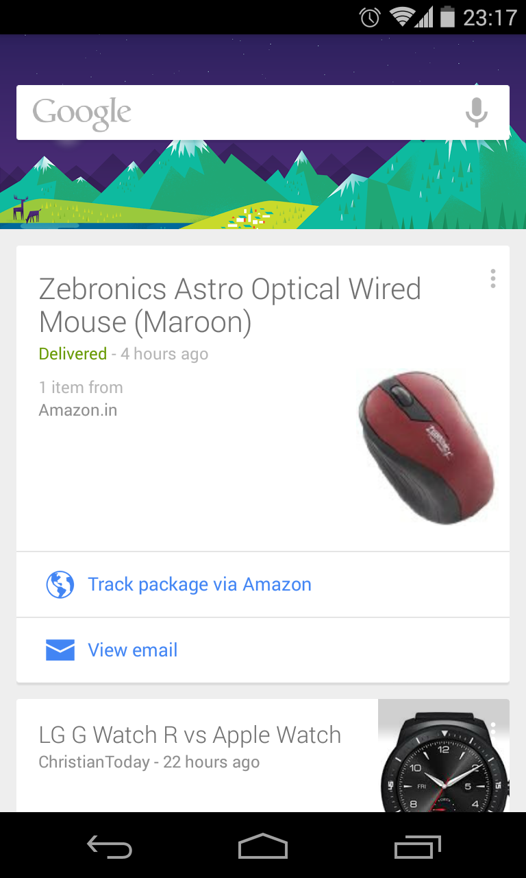
“Google Now” updates from GMail
Another
step… we will receive notification about flight, delivery of package in “Google
Now” based on the email content. Track package link will be available in
“Google Now”
New Inbox
The new
Inbox from GMail is the combination of above features and few other Google+
tools. It has used concept of tabs, Google Now updates, Google+ reminders and
more importantly “Material Design”.
The
material design makes it fresh and cooler than GMail. As of now GMail and Inbox
works together and long term one can fade away. Now let’s see how it looks
This is
how my desktop version looks

Similar to
GMail tabs, emails are categorized based on the content. On clicking any tab, I
will be able to see the emails. Colors used are very mild and pleasing to eyes.
Different actions are displayed as we move the mouse over the email.


Instead of
“move to trash” or delete Inbox has used word “mark as done” – with tick
mark. These mails will be moved to
“Done” inbox. Also we can snooze an email for some duration (say you want to
pay the bill after 2 days and till then you don’t want to see the mail). Also
on moving the mouse on icon, it changes to checkbox for selecting multiple
mails (Small but beautiful feature)

Also Inbox
uses images wherever possible – purchase update, map links etc to make it more
dynamic.
Search email
Search is
made simpler with wide text box at the top and the way results displayed
GMail

Inbox

Compose
GMail
has “compose” button to start a new email thread. Inbox shows various options
on hovering mouse
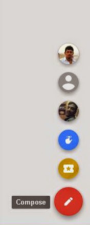
We can
create reminders directly from Inbox (it was part of Google+ before) and find
recent contacts as well.

Also
Invite button is available to send the Inbox invite to other friends.
The End
I am using
the new Inbox (Desktop and Android version) from 2 weeks and it looks
refreshing. Google is applying material design everywhere and Inbox looks
cooler than GMail. But sometimes I get confused which mail is latest since
Inbox reorders based on the action. It’s a matter of practice I guess
Have you
tried the new Inbox from GMail? Do you feel it is as good as GMail? Please feel
free to comment.
Play Store Link - Inbox
Take
care!!
Comments
Post a Comment
Please add your valuable comments